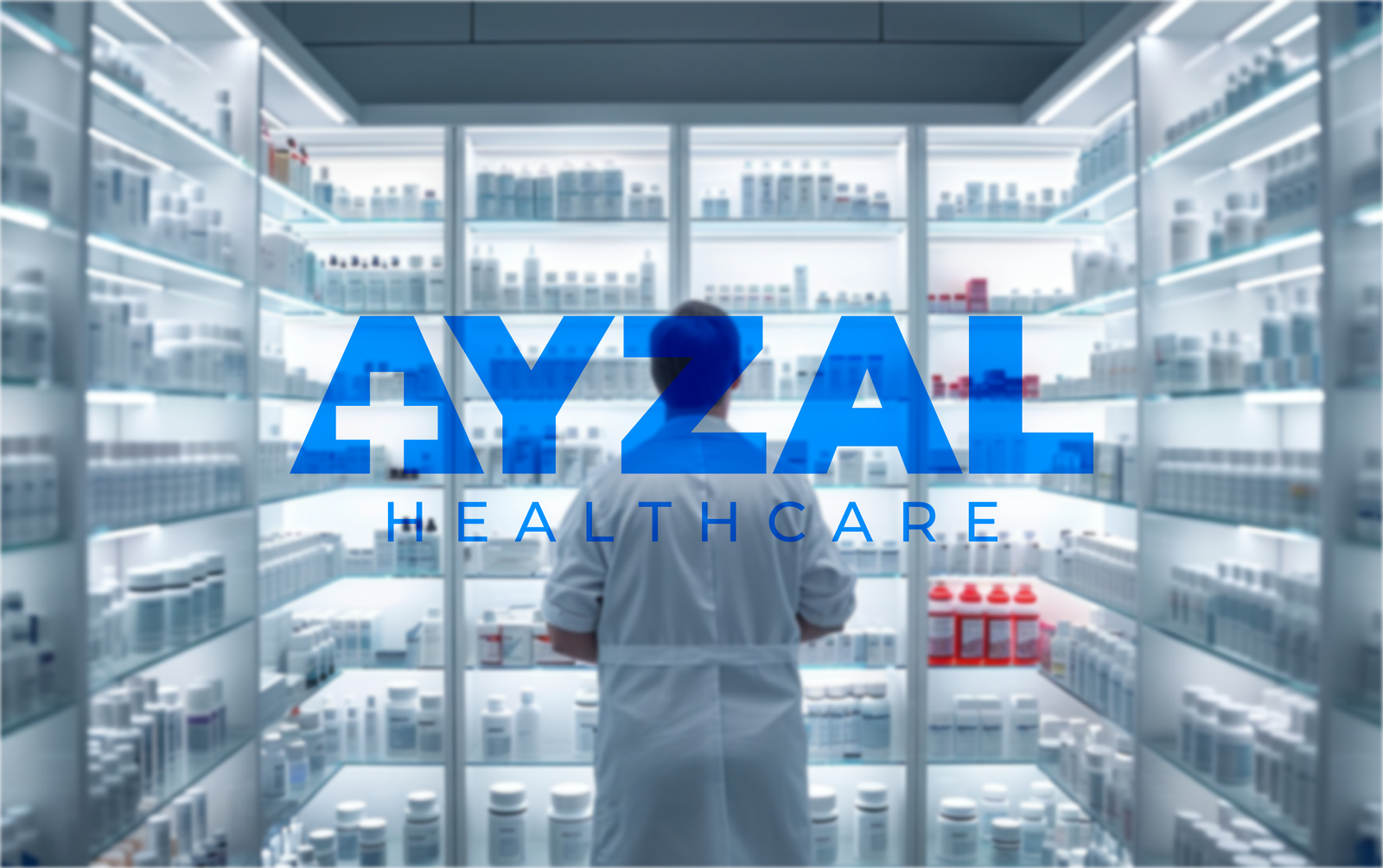
AYZAL Healthcare is a medicinal wholesaler that makes sure pharmacies, hospitals, and healthcare providers get the quality medicines they need: on time, every time. They’re all about reliability, trust, and making healthcare supply smoother and more efficient.
Client: Muhammad Asif Geography: Jammu & Kashmir, India Sector: Health Care Scope: Logo Branding Objective: Our goal was to design a bold and trustworthy brand identity that clearly communicates AYZAL’s reliability and strong presence in the healthcare space.
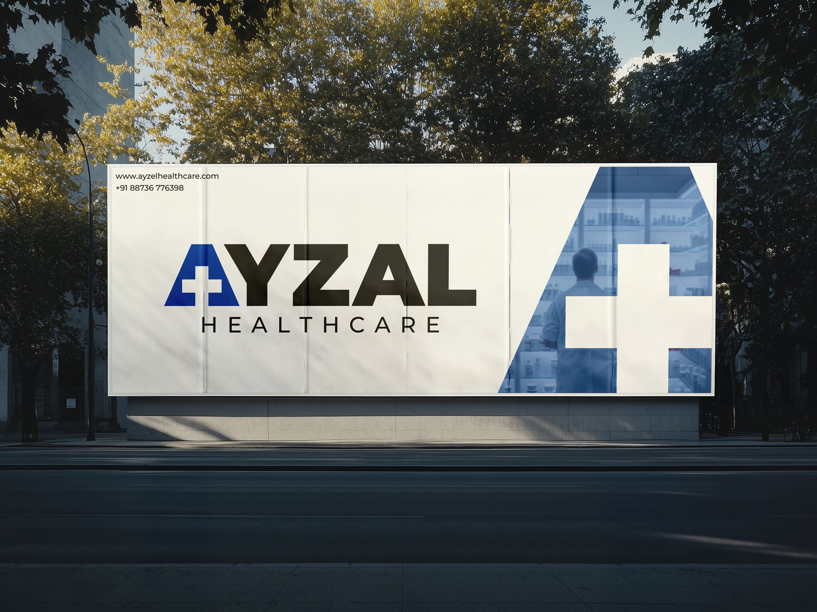
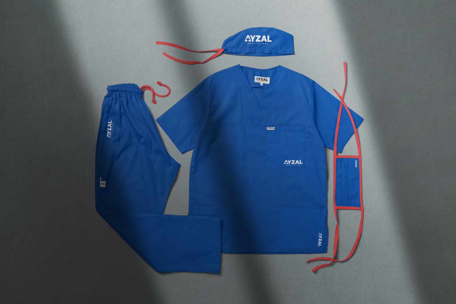
The Branding Challenge
When AYZAL came to us, they already had a strong purpose. But their branding didn’t quite show it. It looked a bit too basic and didn’t give off that professional, trustworthy vibe that’s super important in the medical world. They needed a visual identity that felt sharp, clean, and totally healthcare-ready.
The Branding Outcome
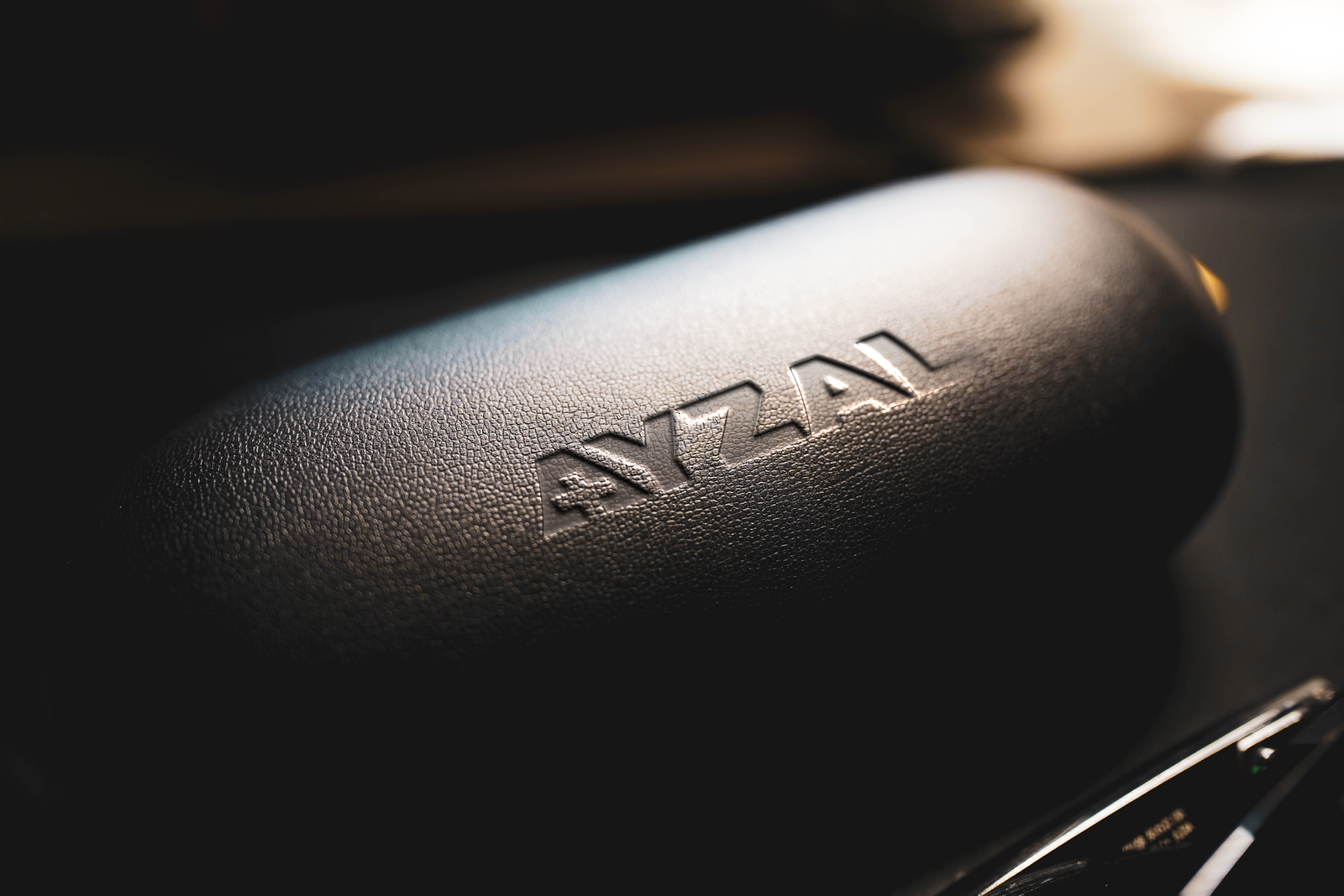
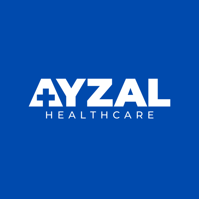
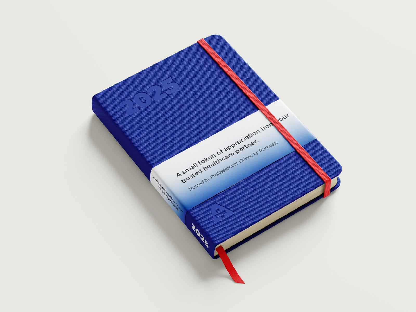
We gave AYZAL a bold new look that instantly says “professional and dependable.” We redesigned the logo using a strong, modern font and added a smart little medical cross right inside the “A” to clearly reflect their industry. The deep blue color we used brings that classic healthcare feel: calm, clean, and trustworthy. To balance things out, we paired it with simple, sleek typography for “Healthcare,” keeping it easy on the eyes but still powerful. The end result? A brand that feels confident, clear, and ready to stand out in the world of pharmaceutical wholesaling.